Ever found yourself squinting at a tiny website on your iPhone, wishing for the good old days of desktop browsing? You’re not alone. Many users crave the full website experience without the frustration of endless zooming and scrolling. Luckily, switching to desktop mode on an iPhone is easier than finding a Wi-Fi signal in a coffee shop.
Understanding Desktop Mode on iPhone
Desktop mode on an iPhone provides a browsing experience that closely mirrors that of a computer. Users access full versions of websites rather than mobile alternatives. This mode displays more content without excessive zooming or scrolling.
Switching to this mode benefits users seeking to view graphics-rich sites, complete articles, or interactive content. Websites often change layouts based on the device type, optimizing for mobile screens or desktop interfaces. When in desktop mode, a user gains the complete functionality of a site, accessing features that may not be available in mobile view.
Activating desktop mode is straightforward. The device’s browser, Safari, allows this switch through a simple selection. Apple designed this feature to enhance usability for those requiring extensive browsing capabilities on their user-friendly devices.
Mobile browsing typically limits visibility, forcing users to zoom in and out. Desktop mode solves this issue by displaying an expanded view. It improves interaction with various website components, such as forms, menus, and media players.
Specific scenarios highlight the benefits of desktop mode. For instance, accessing a banking site may demand a full view for security features. Similarly, using online tools, like graphic applications or document editors, often requires an extensive display that mobile views cannot provide.
This mode caters to professional needs, educational pursuits, and detailed research tasks. Therefore, engaging with desktop mode means users enhance their overall browsing efficiency on an iPhone. By understanding how to activate this mode, users unlock a more versatile browsing experience tailored to their specific needs.
Steps to Change to Desktop Mode on iPhone

Switching to desktop mode on an iPhone is quick and enhances web browsing. Follow these steps for a smooth experience.
Accessing Safari Settings
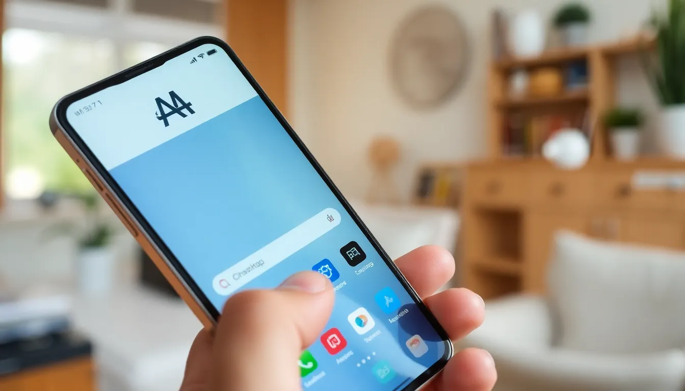
Open Safari on the iPhone. Tap the “aA” icon located in the top left corner of the screen. A drop-down menu appears with customization options. From there, select “Website Settings.” This action directs users to features for managing the browsing environment. Adjust any necessary preferences to enhance usability. After making adjustments, users are ready to proceed with accessing websites in desktop mode.
Requesting Desktop Site
Visit the desired website within Safari. Then, tap the “aA” icon again. From the options presented, choose “Request Desktop Website.” Safari will refresh the site and display it in desktop mode. This feature allows users to view full versions of websites. Remember, for some sites, refreshing the page might be necessary to see changes. Users gain access to additional functionality not available in mobile views, streamlining their browsing tasks.
Using Other Browsers for Desktop Mode
Switching to desktop mode isn’t limited to Safari. Other browsers like Google Chrome and Firefox also offer this feature, enhancing the browsing experience on an iPhone.
Google Chrome
To access desktop mode in Google Chrome, users start by launching the app. Once opened, they can tap the three-dot menu located in the bottom-right corner. Selecting “Request Desktop Site” from the drop-down menu activates the desktop version of the website. This method allows for a more comprehensive view of content, especially beneficial for web applications or extensive articles. Graphics and layouts typically display more accurately, enabling better interaction with desktop-specific features.
Firefox
Activating desktop mode in Firefox follows a similar process. Users begin by opening the Firefox app and tapping the three horizontal lines in the lower-right corner. Then, they choose “Request Desktop Site” from the menu options. This action prompts the website to reload in desktop format, giving access to a layout closer to a traditional computer. Desktop mode in Firefox enables users to navigate complex sites efficiently, ensuring a productive browsing experience.
Troubleshooting Common Issues
Switching to desktop mode on an iPhone can occasionally present challenges. Users might not see the expected desktop version after requesting it. This often occurs due to cached data. Clearing Safari’s cache may solve this.
Sometimes, the website may not support desktop mode. If issues persist, checking the website’s compatibility with mobile devices is advisable. Some sites automatically redirect to mobile versions regardless of user preferences.
Another common issue involves browser settings that restrict desktop requests. Ensure that the settings allow for desktop site requests. In Safari, this setting can be adjusted through preferences found in the “aA” menu.
Users might also face problems if their iPhone is not running the latest version of iOS. Updates frequently include enhancements that improve browser functionality, thus enabling better desktop mode performance. Checking for updates under Settings ensures users get the best experience.
Additionally, using third-party browsers introduces variability. While most browsers like Google Chrome and Firefox provide desktop mode, the activation process differs. Familiarizing oneself with each browser’s method ensures smoother navigation.
Lastly, internet connectivity plays a crucial role in accessing desktop sites. A slow or unreliable connection could hinder the loading of desktop versions of websites. Ensuring a stable connection often resolves loading issues.
Remember, each of these troubleshooting steps offers a pathway to a more successful browsing experience in desktop mode. Having these solutions at hand helps users navigate common hurdles effectively, enhancing their overall online interactions.
Switching to desktop mode on an iPhone transforms the browsing experience by providing access to full website functionality. This simple adjustment allows users to view content without the limitations of mobile layouts. Whether it’s for accessing detailed articles or utilizing complex web applications the benefits are clear.
By following the straightforward steps in Safari or other browsers like Chrome and Firefox users can easily enhance their online interactions. Troubleshooting tips ensure a smooth transition to desktop mode. With this newfound capability users can navigate the web more efficiently and enjoy a richer browsing experience tailored to their needs.
